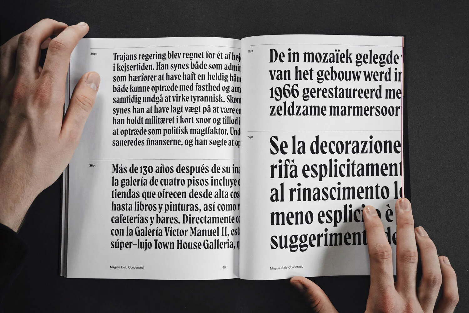
Magalie Typeface
This specimen was created to introduce Magalie, a display serif typeface designed by Mark van Leeuwen in 2019 and realeased in 2020.
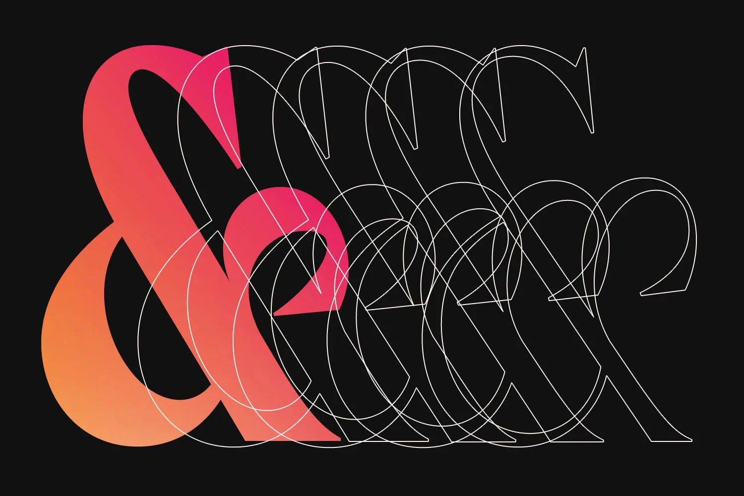
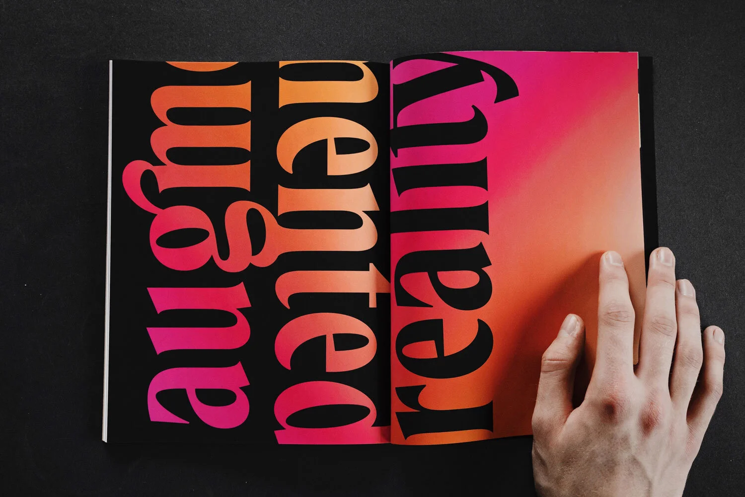
Magalie is a playfully serious yet seriously playful display typeface. Its smooth strokes and sharp serifs give it a moody and synister look, but the typeface still holds a certain playfulness to it. Magalie takes inspiration from classic serif typefaces and calligraphic forms. The oblique contrast system is accentuated all across the five styles of the typeface. It takes pride in the somewhat unconventional aesthetic of its shapes, symbols and expressive ligatures.
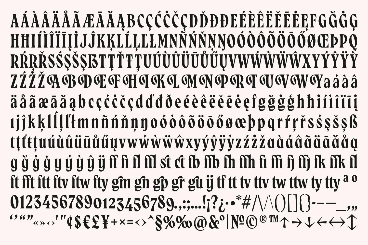
Magalie includes five weights, supports an extended Latin glyph set and includes numerous Ligatures, Stylistic Alternates, Swashes & more...